
I personally LOVE choosing colors for a space; it’s a great way to show your personality through where you live. My house is going through a big change in color right now; we have had yellow throughout the main living areas of the house for years. Yellow walls and an off-white ceiling with yellow undertones. We also tried to do a darker yellow accent wall that you cannot tell is an accent wall. It just blends with the rest of the yellow. What doesn’t help is that all our furniture is brown. Brown furniture with every wall being yellow, and our lighting leans on the warmer side… everything in the house is yellow. Everything! It is so time for a change.
Start With What You’re Keeping
The first thing I do when coming up with colors for a space is look at anything you are going to keep. If you are moving into a brand new place and have no furniture and nothing in the space, good for you! You get to pick as many colors as you would like and go crazy with different testers and paint swatches. However, if you are bringing furniture with you that you want to keep or have big furniture of sentimental value, you need to be a bit more careful when choosing the colors. For me, we have wood tables and railings, frames, and furniture pieces. Everything is wood, which is great, but the yellow isn’t serving it well. It all leans too warm, and the entire space has an overwhelming yellow cast. My starting point for this project is looking at what looks good next to all the brown furniture and frames.
Understanding Undertones and Building a Cohesive Palette
The two main undertone categories I look at are warm and cool. Warm undertones are more red, orange, or yellow. Cool undertones are more on the blue, green, or purple side. Like I said before, my whole house had these yellow and warm undertones, making everything feel dated and visually one-dimensional. There is no hard rule that you have to balance the warm and cool tones, but going too hard in one direction can really make a space feel flat and monotonous! If you have warm-toned furniture and flooring (like I do), then I would consider picking a cool-toned wall to create some contrast. Just because it’s cool-toned doesn’t mean it has to feel cold or uninviting.
To build a cohesive palette is to get things that look good together but don’t necessarily match. This is why pastels look good together, and jewel tones look good together even though they have different colors. Pastels have that softer look, while jewel tones are much richer and bolder. They don’t have to be the same color to look good together! It’s about finding colors that have something in common without making everything look like it came from one matching set. I already knew in my space that I wanted my walls to have more of a cool-toned quality after all the warm tones.
Test Your Colors in Different Lighting
I brought a bunch of different paint swatches home and put them up on my wall. Each corner got tested for colors I thought I would like because the lighting would change in each spot throughout the day. I went through so many different colors, and I thought I had it narrowed down enough that I could go buy the tester cans to paint onto my wall. I ended up not choosing any of the colors that I bought testers in, but they helped guide me in the right direction.
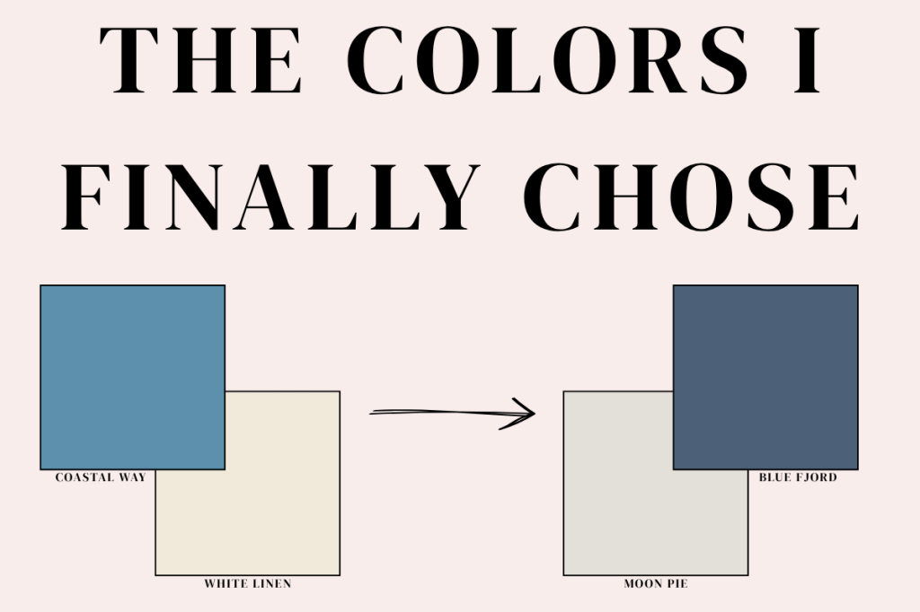
The Colors I Finally Chose
Based on all those testers, I decided on a blue; it’s more of a navy/royal blue for an accent wall with a very light, warm off-white with subtle beige undertones. The white is more on the beige side; it’s actually Moon Pie by Dutch Boy. I matched that with Blue Fjord by Pittsburgh Paints & Stains, from their PARAMOUNT line, as my accent color. I had picked Coastal Way by Dutch Boy with White Linen and actually bought tester cans of each, but it ended up not being the right color for my space. It would have worked, but it wasn’t what I was looking for, and that’s okay; you can always pivot. You might decide you love a color but want to change it in less than a year after living with it.
Color can do a lot for your space and your mental health. I encourage anyone looking into repainting to look at your space, get some test swatches, and have fun with it. Paint isn’t hard to change if you are willing to do it yourself! It is also you who will be living with it, not me, not some other designer. You. If you love a color that everyone tells you not to use but you are confident in it, use it! If you hate it, it’s just a can of paint away from a change!


Leave a Reply